HOME
Album cover, Analog Collage
In 2014, Midwest Collective released the debut album, “Odyssey,” of then Florida-based musician, Home. Having previously done work for the label’s compilation albums, Home was a fan of my work and wanted me to make a cover for his first album. The album was enjoyed within the underground electronic scene for a year or so, until it was used in several Vines that went viral in 2015 and 2016. Subsequently, the album shot to the top of Bandcamp’s selling charts, and began getting serious attention across the internet. The YouTube channel Electronic Gems garnered the highest views on YouTube with a video of the track “Resonance” getting 70 million views. This track is clearly the standout favorite from the album, as it now has 15 million listens on soundcloud, and 69 million listens on spotify. In 2016, the label Dream Girl Records did two vinyl runs that I provided additional art for that sold out in hours, with copies now reselling for $600.

Vinyl layout

Both runs in 2017
-----
I had no idea what this album would become for so many people when I started the job. I became familiar with Home through the music collective we were both a part of at the time, and the singles he posted on his Soundcloud. I was a fan of his as soon as I heard his work, and designed a cover for a collection of his early singles for an EP I called “Homage”, which he signed off on. Knowing the tone of that cover, as well as the images he chose as covers for his Soundcloud singles, I set out listening for the Odyssey design.
Setting out, I began listening to Home’s composition. The heavy synth production was reminscent of early synth music from the 1980's, but the album felt fresh overall. Despite the moody and mechanical track names, the music they held was bright, energetic, and affective. It was a very textural album, with many layers of evocative tones weaving in and out across each track.
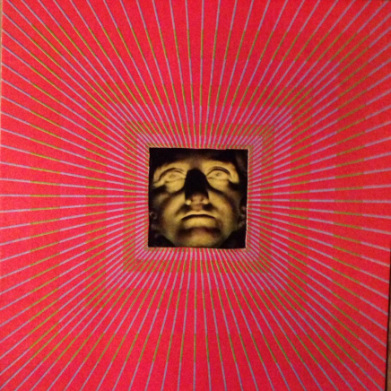
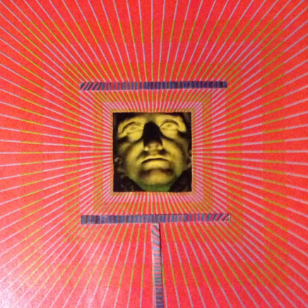
At the time, I had an illuminated, sculptural face framed by some 70’s era Op-Art that I didn't have a plan for. Looking at it while listening to Odyssey, I saw it matched the mood of the album. I believed the mysterious, overwhelming impression the composition gave fit the totalizing absorption the music created in the listener. I very much felt sucked into Home’s world when I listened to Odyssey, and knew others would feel similarly.
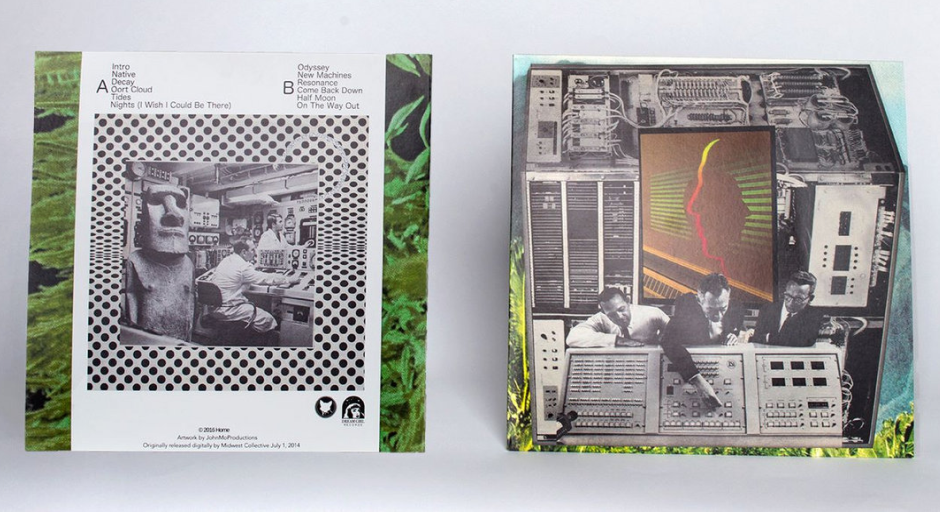
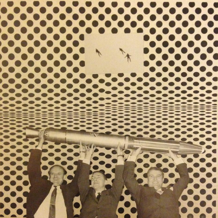
As an alternative route for additional options, I went in a more vintage and technological direction. In hindsight, I don’t believe I consciously was prioritizing a black and white theme, but when I discovered the large machine cube, I knew I should pursue it. It provided a moody backdrop for a more specific foreground I had yet to find. Coming across pictures from early rocketry experiments, I found what I needed: an image of two men bemusedly watching a third interact with a machine. I thought this worked well with the mechanical backdrop, but now felt the composition needed a point of color to set it all off. I was hoping for something that spoke to the 1970’s or 80’s that I thought Home’s synthesizers nodded to. I was lucky that National Geographic did a piece on holograms in the 1980’s. The piece included an arrangement of faces that I thought worked perfectly with the rest of the piece as a colorful, abstract presence that gave the image life.
Home really liked the machine direction, and went with the more vertical orientation. Because he had some visual experience himself, he digitally tilted the image, added a grey background, and a shadow effect on the collage.
Homage EP cover, 2014


After Odyssey, and specifically the track “Resonance,” began getting millions of views, a small label called Dream Girl Records approached Home and Midwest Collective to do a vinyl run of Odyssey in 2016. Home agreed, and I was asked to do a back cover for the album.
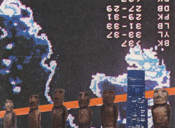
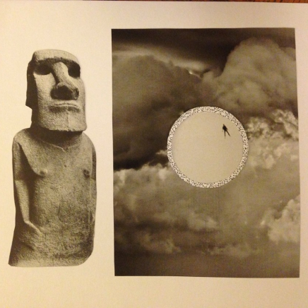
Working with the machine-heavy cover I designed for the front, I knew I wanted to stay in a similar vein. I also knew I wanted to keep things mostly black and white to match the front. Home was a fan of using images of the mysterious Moai for his early singles a few years before, so I thought it might be interesting to work that in somehow. I assembled some options that included elements of early rocketry, vintage machinery, and Moai, as well as abstract references to the listener in the form of shadowy figures. On some of them, I anchored the images on top of other 70’s-era Op-Art pieces, textured skies, and moonscapes. Overall, I felt I had a good selection of various directions Home could go in for the back.
There was no question for Home when he saw the options, though: it had to be the Moai in the machine and technician-filled room. I liked all of the options, but was glad he chose that one, as I also felt it was the strongest choice. Once selected, I sent it along to the label. Afterwards, Home decided he wanted to go with a more colorful background for the images, which I can’t say I would’ve recommended. The label agreed, though, and they centered the images in front of tropical looking landscapes. I don’t think that fit the feel of the album, but at that point it was out of my hands. Either way, I was happy to be a part of the project and see fans quickly buy up both runs.