An app design for consumers to get free professional jewelry inspections
 View Prototype
Roles
Research | UX/UI Design | Branding | Prototyping | Testing
Problem

“What happened to my ring?!”
Diamonds may be forever, but the jewelry they’re found in wears down and can break over time. Most people are not aware of this however, and consequently risk these very expensive and sentimental objects falling apart. A survey I conducted for this project indicated that the vast majority of respondents were unaware of the need to inspect their jewelry, and had never had a professional inspection done.
Solution
A jewelry inspection app that provides professional feedback on the condition of jewelry pieces
Using survey data, I began to flesh out the gaps in jewelry owners knowledge and inspection opportunities. I searched the market for existing solutions to this or similar problems, and identified strengths that could be leveraged in my own design. I decided the best option would be a native app that utilizes smart phone cameras to supply a guided set of photos of user’s jewelry, and sends those photos to be reviewed by a professional jeweler. The jeweler then sends their review to the user’s Inspection Home inside the app.
Survey
To begin with, I knew I needed to first understand more about how jewelry owners thought about and interacted with their jewelry. I started with a survey questionnaire that sought to uncover the strongest trends and behaviors of jewelry owners, and test them against the ideas I had about what they may want. The survey results provided several surprises and were very useful for informing my future designs.
View Full Analysis-
Do not examine their own jewelry
-
Do not have their jewelry professionally inspected
-
Unaware that jewelry should be inspected
-
Interested in a free professional inspection
-
Would get inspections more often if free
-
Would submit inspections through their phone
Competitive Analysis
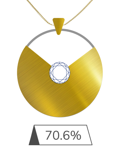
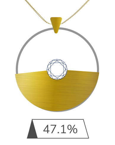
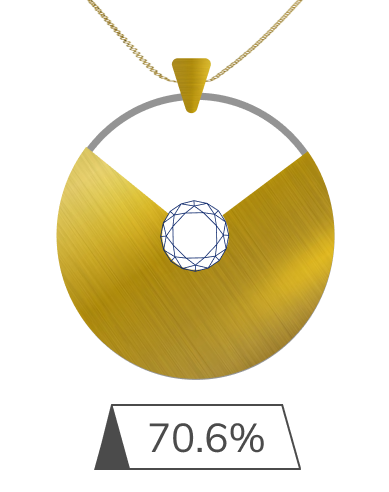
The idea for a photo inspection service for jewelry is new, so I couldn’t find any other companies out there doing this exactly. However, I think there is some precedent both in offering similar kinds of jewelry services, and also in photo estimating services in different industries. I looked at three companies that orbit the kind of service I would be trying to provide, and sought to find useful strategies or features that might be replicated. For each company, I created a SWOT analysis, defined their positioning, audience and differentiators. Insights I gathered from the process are highlighted below.
View Full Analysis

- Ensure you get the most comprehensive information you can for an inspection.
- After providing an inspection, provide a list of local partners who might be able to complete the work in an projected amount of time. The user, then, won’t have to part with their jewelry, but can make a targeted, informed trip to a specific jewelry store with a rough idea already of what to expect.
- The inclusion of video might be useful, learning from criticisms of the limitations of Progressive’s tool and jamesallen.com’s successes.
- Frame the inspection as an educational experience and teaching moment, not a sales opportunity.
Personas
I created these user types using the larger trends of my survey results. The primary features that people reported wanting were detailed write ups on the condition of their jewelry, suggestions on where work could be done, rough cost estimates, and advice on jewelry care. Respondents also expressed an interest in general education material about jewelry. To try and capture these priorities and reflect other survey insights, I made four personas that expressed interests on different aspects of the potential service.
View Full PersonasJess | The Novice


Goals
- "See if my engagement ring is ok."
- "If anything needs help, learn where I can have it fixed."
- "Learn how much it’ll set me back."
Motivations
- Jess is a registered nurse living in Dayton, OH. She frequently has to wear gloves at work, so doesn’t wear her jewelry most of the time. She likes to when she can, though, and wants to make sure they’re taken care of.
Frustrations
- "I didn’t know I should be doing this."
- "I don’t know where to go, and sales people are so pushy."
- "Is this going to be really expensive?"
Denise | The Collector


Goals
- "I have a lot of jewelry, but I don’t want to spend all day doing this."
- "I want to see some options on where I could get this work done."
Motivations
- Denise is a sales manager at a large telecom firm in Raleigh, NC. She likes to exercise and prefers her boyfriend check with her before he buys her any jewelry. She likes to wear jewelry, but isn’t sure why or when she should have her stuff looked at.
Frustrations
- "I care about my jewelry, but don’t really want to think about this."
- "I’ve bought jewelry all over the place, but don’t know who to take it to for repairs."
Andrea | The Curious


Goals
- "Learn more about my jewelry."
- "It’s been a while since I had my jewelry looked at, I guess I’d try this out."
- "Look at some beautiful jewelry."
Motivations
- Andrea is a high school English teacher, and has bought or been gifted many pieces of jewelry in her life. She also inherited a number of rings from her grandmother. She likes to wear her pieces, but is interested in learning more about jewelry in general.
Frustrations
- "I always forget to have my jewelry checked."
- "We moved to Phoenix 4 years ago for my husband’s job and I miss my old jeweler."
Claire | The Skeptic


Goals
- "Go about my life"
- "I guess see if this is a real thing."
Motivations
- Claire works at a coffee shop while finishing her last year of school. She was given a nice necklace from her parents when she turned 18, but doesn’t wear it much. She has nice jewelry, but feels awkward or over dressed when she wears it. She imagines herself owning more when she’s older.
Frustrations
- "I didn’t know I should be doing this"
- "I don’t know where to go, and sales people are so pushy"
- "Is this going to be really expensive?"
User Flows
Writing out my user stories led to my next task of creating user flows for those MVP specific actions. Given the limited areas of focus for this proposed service, and the need for users to supply photographic or video information, I wanted this service to be a native app, and be fairly simple. The user flows reflect those limited and straightforward user options and would be available through a persistent bottom navbar.
View User Flows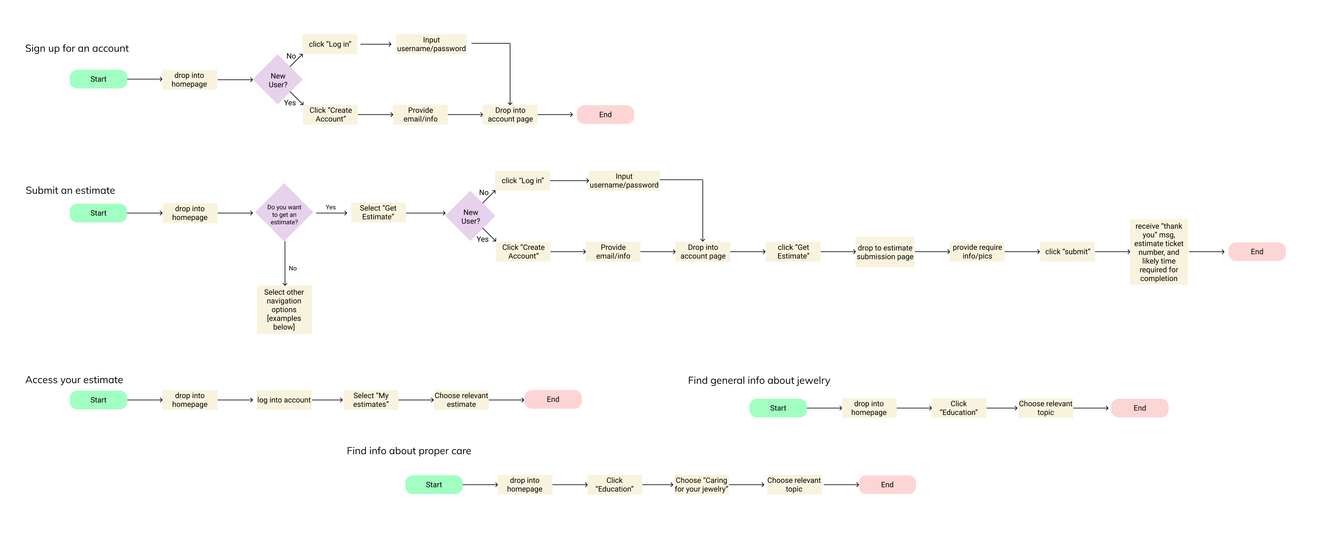
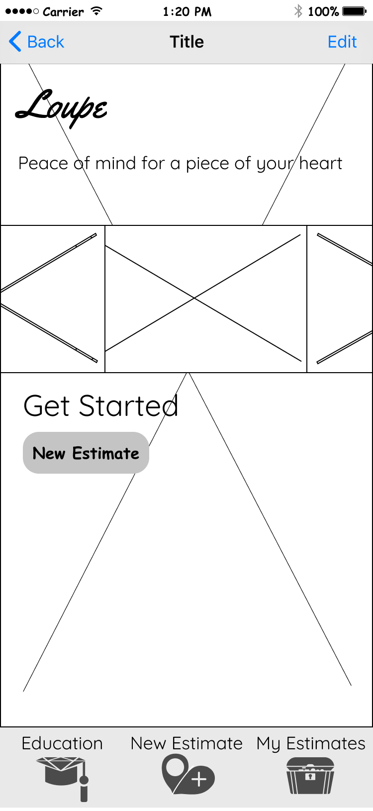
Wireframes
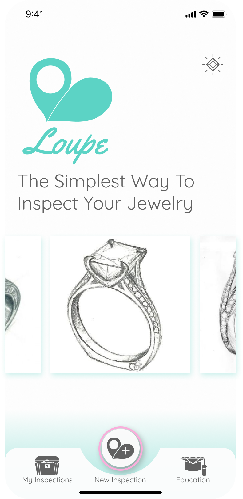
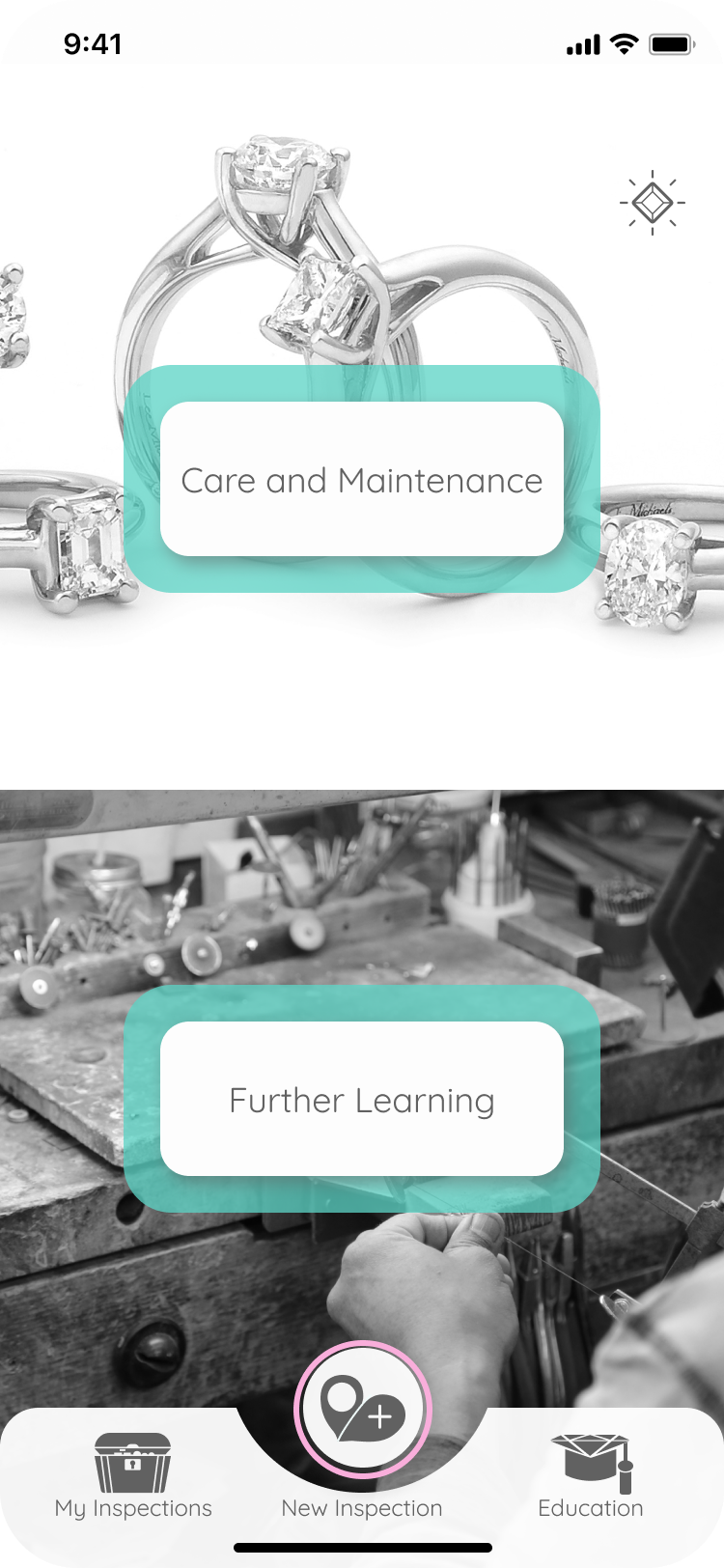
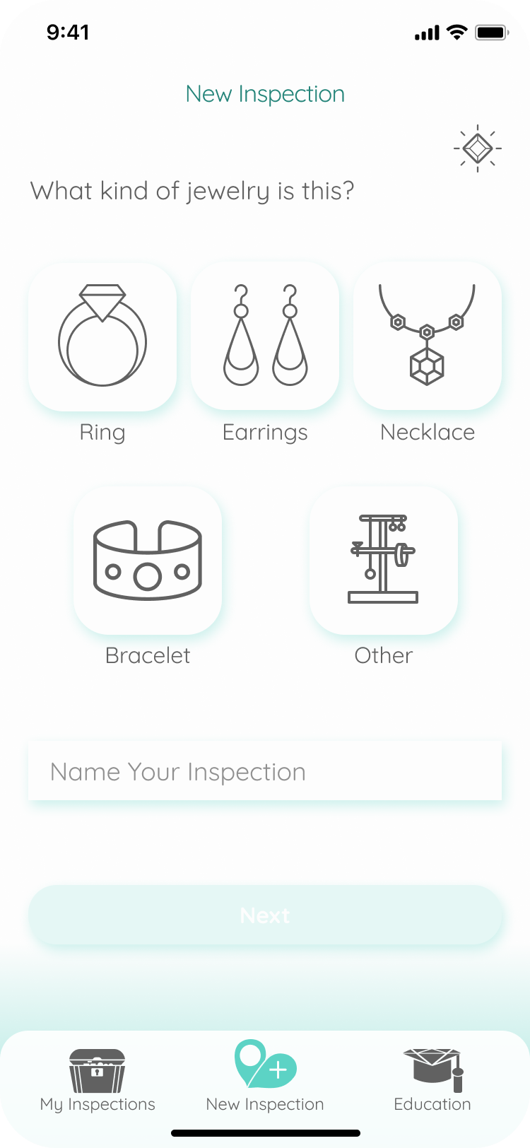
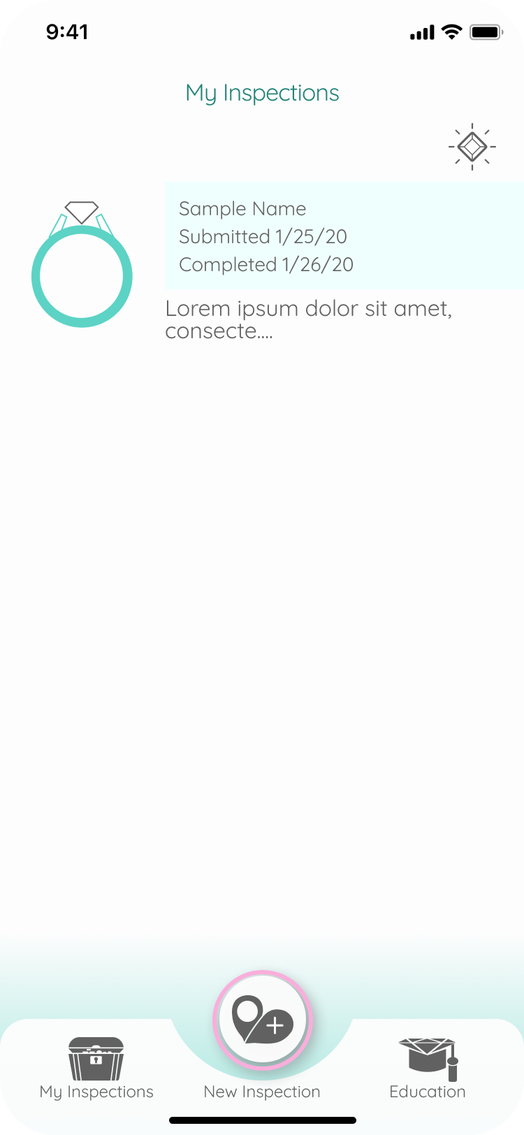
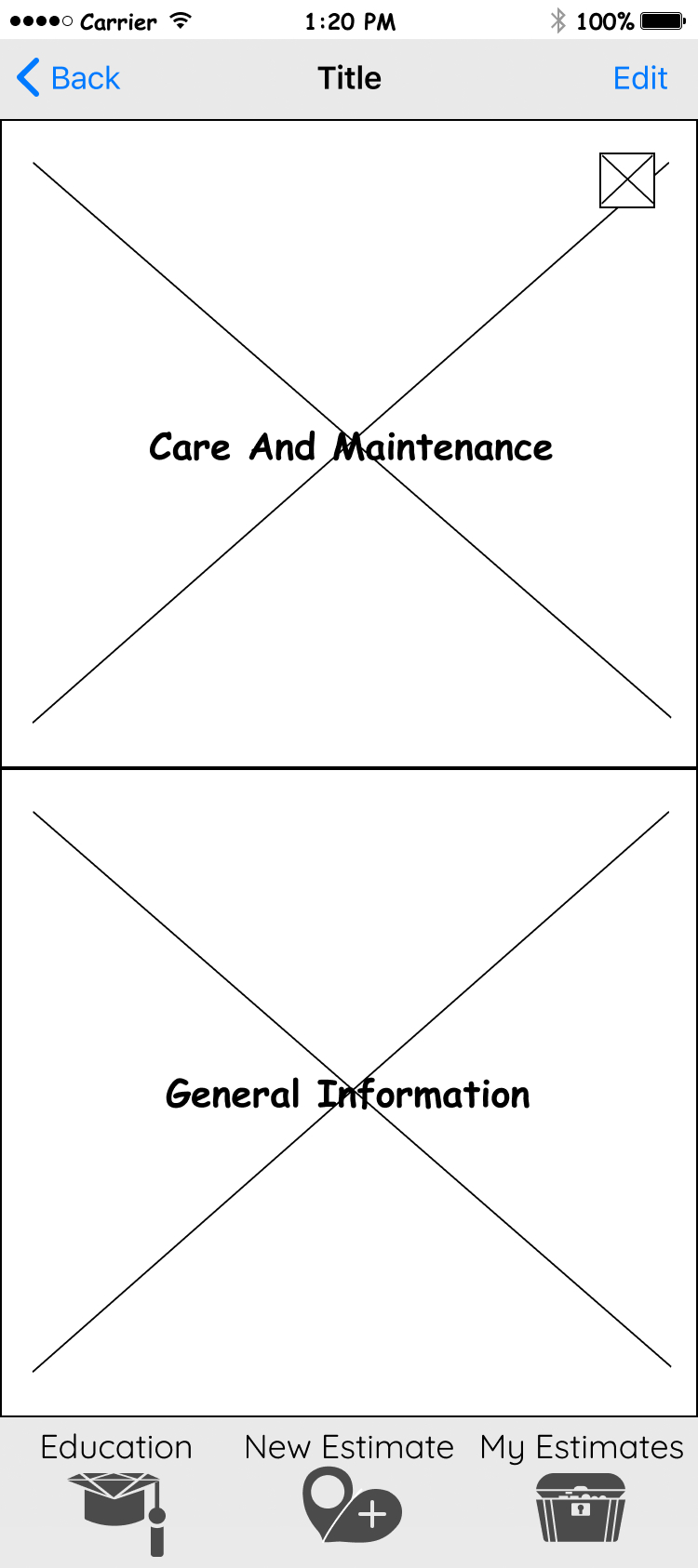
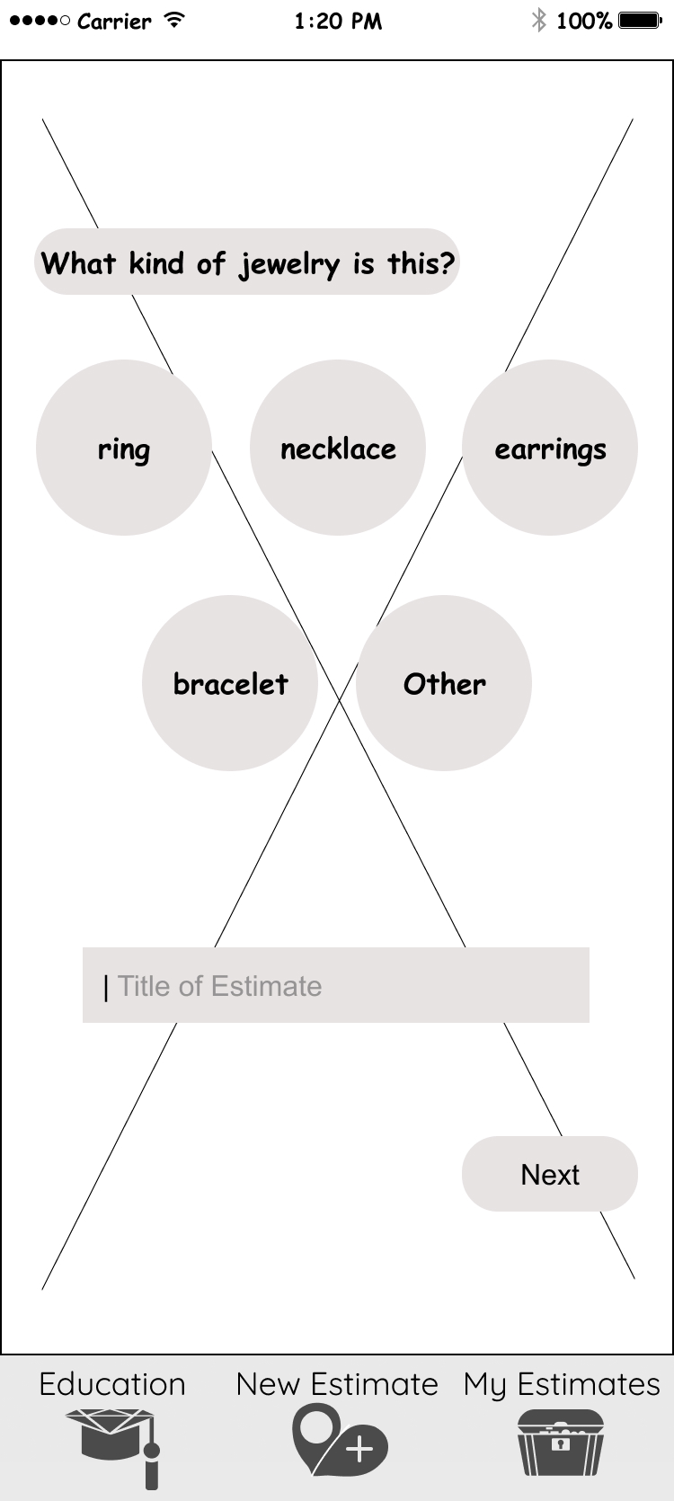
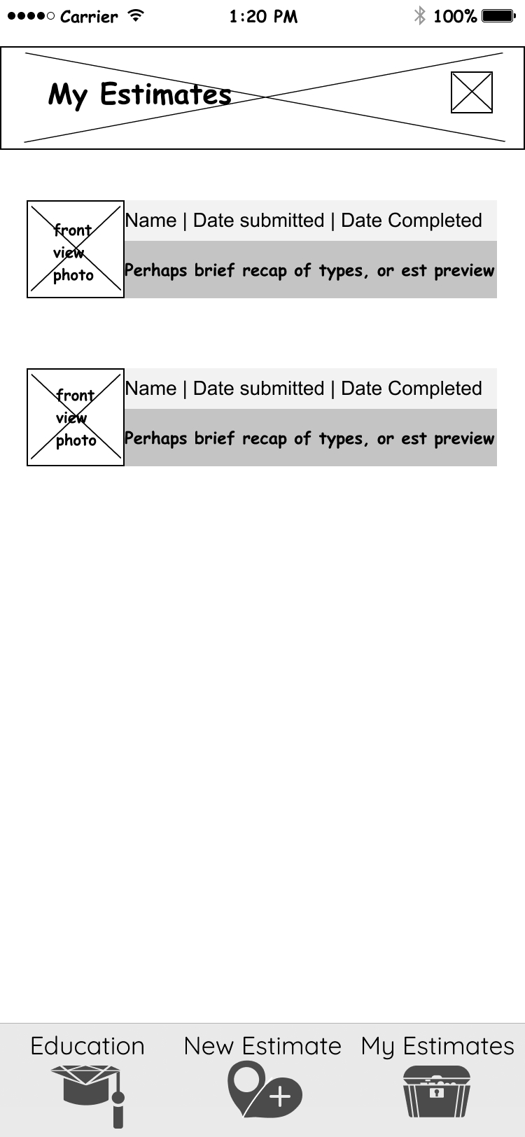
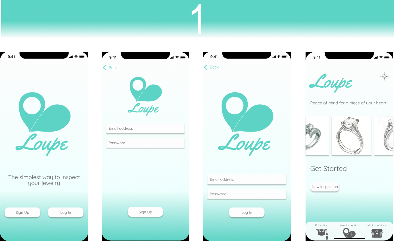
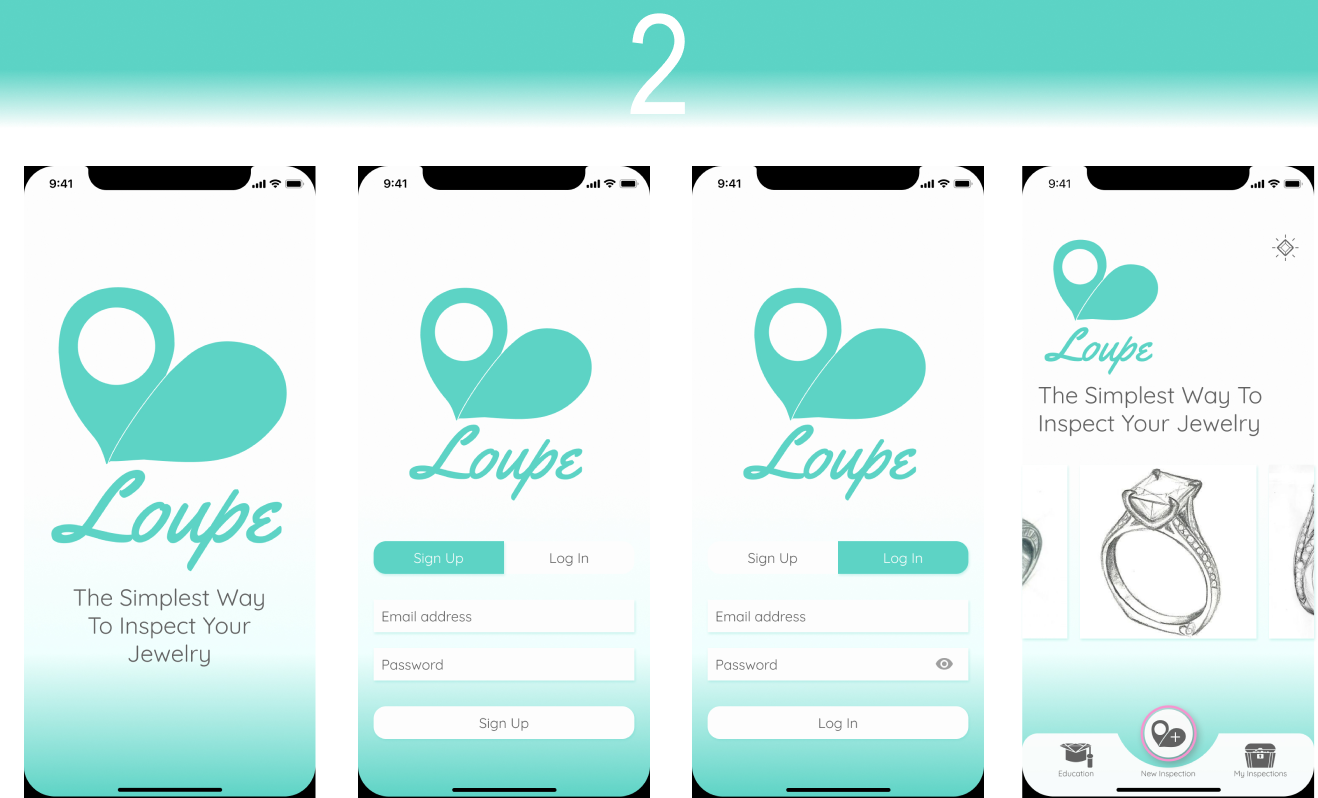
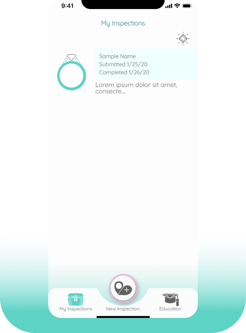
I used Figma to create a rough sketch of what this service might look like by visualizing the user flows and information architecture. The app would be primarily navigable from a bottom navigation bar of three options that reflected the MVP: “Education”, “New Estimate”, and “My Estimates”. The Education screen would have an area for care and maintenance instructions, and another for general articles on jewelry related issues. The New Estimate path would allow users to specify what kind of jewelry they wished to get an inspection for, and request the photos needed for the inspection. The My Estimates screen would contain the list of inspections the user had submitted and Loupe had completed.
View All Wireframes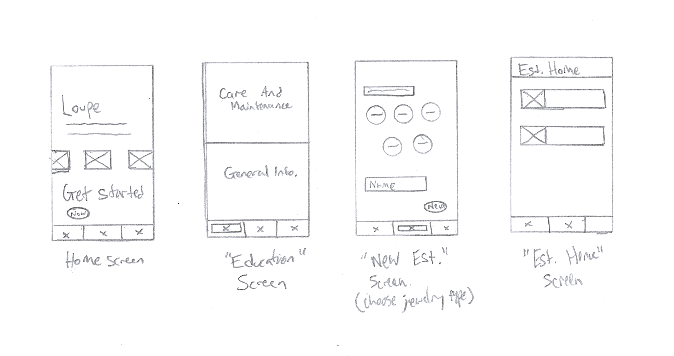
Branding
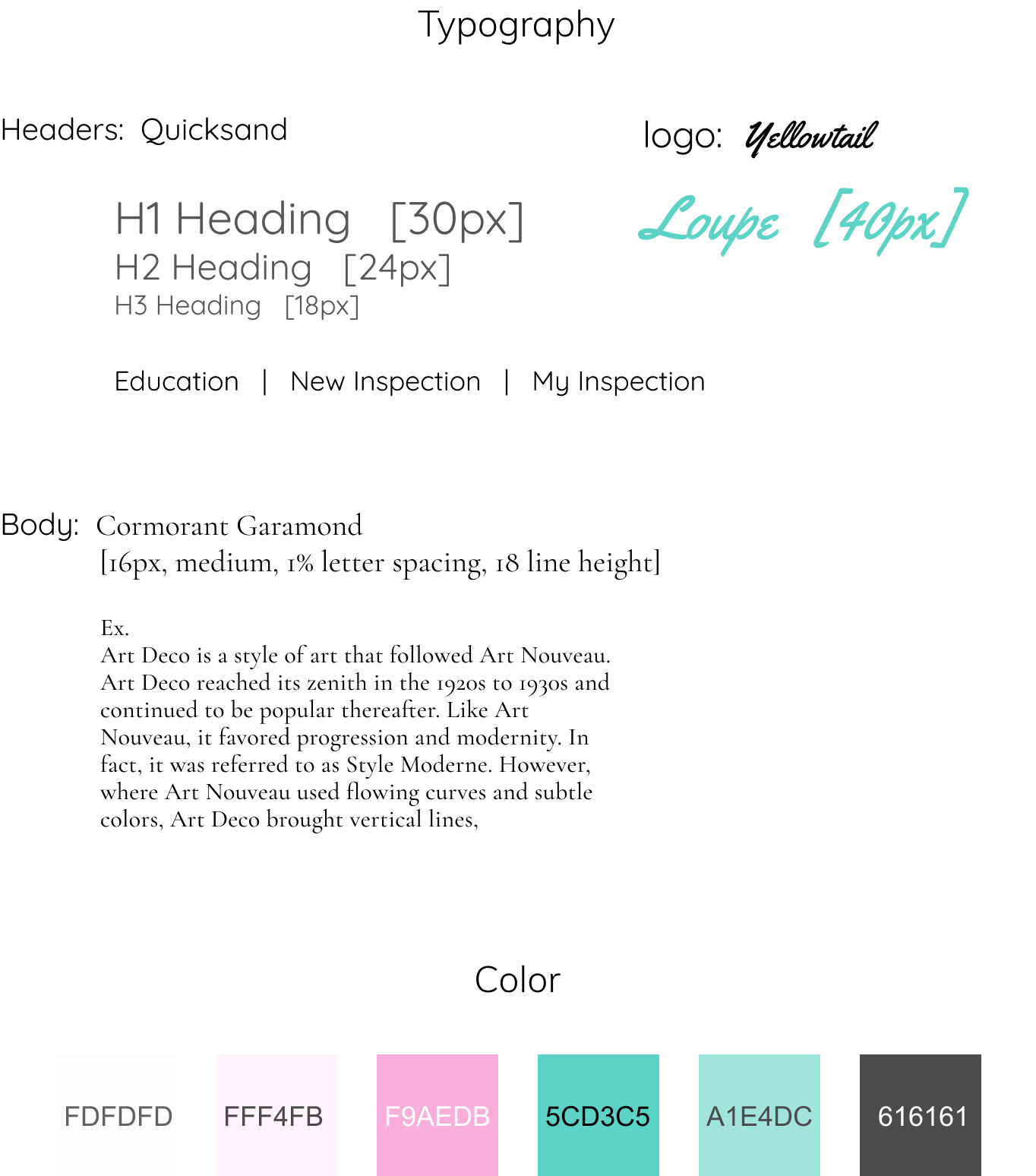
Preliminary sketching and developments in figma eventually led to a style guide that laid out the direction the app aesthetics would take. I wanted to create a look that was bright and welcoming, but also felt trustworthy and professional. I thought that a color scheme of charcoal or white typography on a white or seafoam green background struck the right balance. This allowed for highlights done in an electric pink to stand out in stark contrast and help guide users to where they needed to go. For typography, I chose the majority of content to be in the san-serif “Quicksand”, with the longer articles in my Education section in a serif, “Cormorant Garamond.” I thought these fonts worked well with each other, and set a nonthreatening tone.
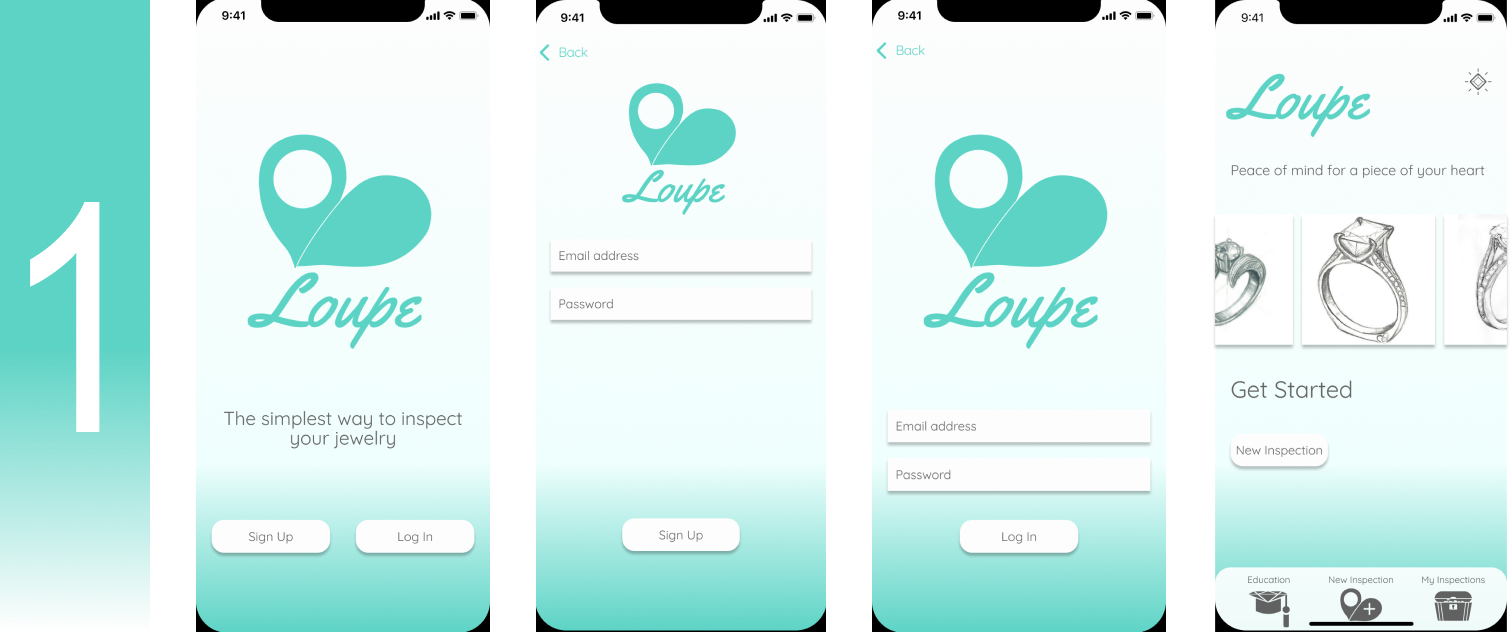
I also developed a logo that was inspired by the jeweler’s loupe, that if turned sideways, looked somewhat like a cartoon heart. I thought this choice struck a nice balance between cute and professional that my potential users might find endearing or clever.
View Style GuideLogo Development
Mockups
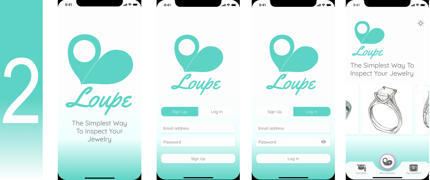
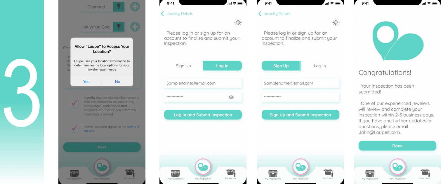
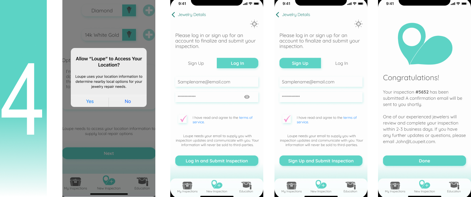
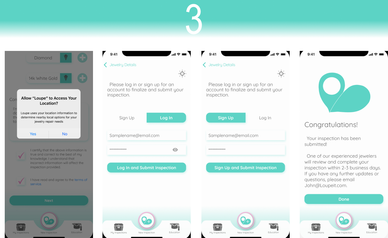
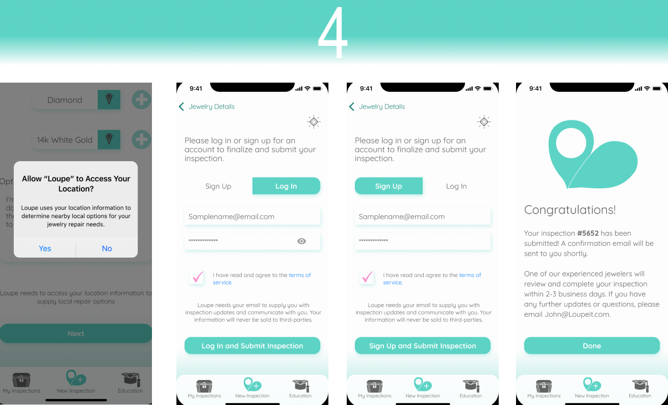
With the branding elements figured out, and the skeleton of the app constructed, I was prepared to bring it all together in a mockup of the app. As it is with the design process, I ended up going through several rounds of refinements to get to the version I felt most confident with. One of the bigger challenges of this phase was figuring out the least intrusive place to include account sign up and permission requests within the app. This change was only one of many I worked through in my refinements, and can be explored below.
Testing
Using Figma’s prototyping tools, I was able to create a prototype to test possible users. I wrote a script to help standardize user experiences and ran three individuals through the prototype. From the results of these tests, I was able to uncover pain points that users felt at different points of my design. Some issues would be easier to resolve than others, but working from their notes, I was able to go back and further refine my mockups into final versions, as seen below. The test version is in pink, followed by the final version in green.
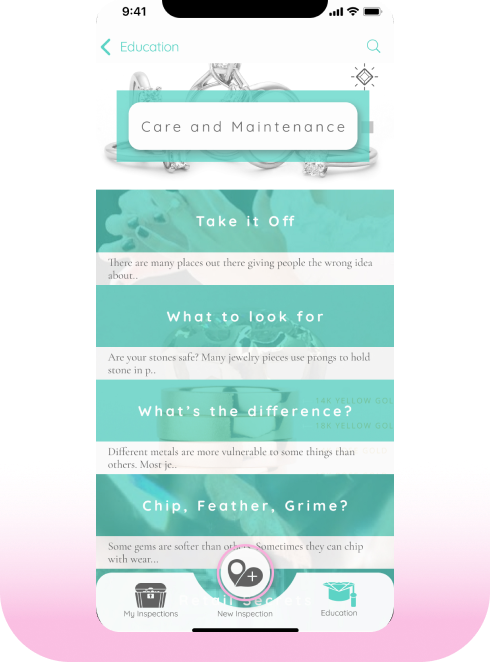
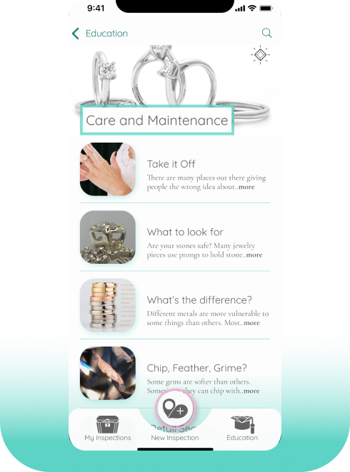
Testing uncovered users were confused about where to click to access Education articles. Applying best practices for listing articles allowed for clearer navigation.
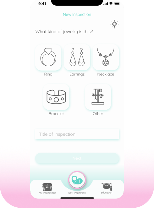
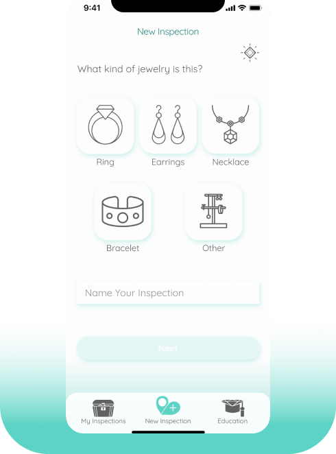
In the tested version, after progressing through the new inspection sequence, a user became concerned they might accidentally hit the “New Inspection” button again and lose their progress. To limit this fear, once inside the new inspection tab, the icon in the bottom bar would lower into line with the other icons.
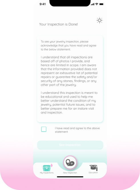
Initially, I wanted the user to sign a liability agreement before they saw their inspection report for the first time. In testing, that step added some annoyance for users since they already agreed to a liability agreement when they submitted their inspection. To address this, I removed that screen entirely.
Conclusion
Overall, this was an educational and rewarding project for me. Given my work as a jeweler, I’m happy to have identified and worked towards a potential solution for a widespread, unappreciated issue within the industry. I believe that the product I designed allows for a simple, comprehensive solution for uninitiated jewelry owners to have their pieces inspected by a professional. The app satisfies the primary goals of my diverse user stories, by offering a service that provides inspections, suggestions for repairs, and provides educational opportunities.
Despite the successes I believe I achieved, there is always room for improvement. As noted in my competitive analysis, I drew inspiration from the Progressive Auto insurance app for submitting damage claims, which relied on users submitting photos of their car damage. After going through user testing, a somewhat repeated point of frustration was the number of photos users were being asked to submit. I felt the number of photos was justified and required, however, because of the difficult task of inspecting a piece that’s not in front of me. To try and resolve this, in a future iteration I may explore the idea of allowing users to submit a video of them moving their piece around to different angles. This may cut down on the time required in that step. Of course this would produce its own frustrations, I’m sure, but may alleviate some other existing ones.