MINE
a cloud storage platform that prioritizes organization through simplicity
Roles
Research | UX/UI Design | Branding | Prototyping | Testing
Problem
My client wanted to build a cloud storage platform, but was unsure of how to go about it. They needed a designer platform that could achieve their technical goals while offering a unique alternative for cloud users. I was tasked with researching the market and creating a design that would fulfill the functional demands of users and develop a compelling brand for my client.
Solution
Survey data showed cloud users’ main complaints were wanting more free space, and better organization options. Examining competitor platforms uncovered a design style that encouraged these frustrations. By building a minimal alternative, from research through prototyping, I addressed these issues and created a novel solution for my client.
Survey
Backing up files for free was the main reason why people use cloud storage, with content creation being second. Improved usability options could help users do more of both, so I set out to try and streamline a cloud storage interface.
View Full Analysis91%
Use cloud storage
95%
Use to save or backup files
62%
Use for content creation tools
19%
Use to save web content
29%
Frustrated with high costs of services
19%
Frustrated by poor organization
81%
Do not pay for cloud storage
90%
Would only pay between 0-10/mo
Competitive Analysis
I chose three popular cloud storage providers to perform a competitive analysis on: Box, Google Drive, and Dropbox. The experience of looking at these services simultaneously was informative and highlighted repeated oversights.
View Full Analysis- Strengths
- Simple interface
- Prioritizes security
- Seems the best organized
- Weaknesses
- Branding focus on the Technical
- Awkward creation tools
- Less well known
- Strengths
- Household name brand
- Most free storage offered
- Offers custom storage plans
- Weaknesses
- Visually busy dashboard
- Too many shortcut icons
- Redundant folders
- Strengths
- Unique features
- Fewer dropdown menus
- Many well-known clients
- Weaknesses
- Weak organization options
- Least free space offered
- Strange word doc UI
Personas
Using trends I discovered in my survey results, I created three personas centered around important cloud user priorities and frustrations.
View Full Personas
The Saver
- Goals
- Save my data
- Don’t spend any money
- "Is my information safe?"
- Motivations
- Ross is a grad student at ASU studying biology. He played soccer all through high school and got a scholarship for undergrad to ASU. He does a lot of lab work and takes photos he needs to access on multiple devices for presentations and such.
- Frustrations
- Too many options for cloud storage
- Plans can be expensive
- Privacy concerns

The Content Creator
- Goals
- Create documents
- Don’t spend any money
- Share files with friends and coworkers
- Motivations
- James works as a ux researcher for a small software firm in Raleigh, NC. He’s married and likes to paddle board when he and his wife make it to the beach. He gets new ideas for work at the oddest times, and frequently is scribbling on napkins or frantically thumbing his phone.
- Frustrations
- Organizing files
- Too expensive
- Need more custom presentation tools

The Meme Lord
- Goals
- Save memes
- Don’t spend any money
- Not waste my phone memory on memes
- Motivations
- Claire works at a coffee shop while finishing her last year of school. She likes to decompress by scrolling through imgur for funny memes. She saves the ones that really get her, but never really looks at them again.
- Frustrations
- Running out of free storage amount
- Too expensive
- Losing track of saved memes
User Flows
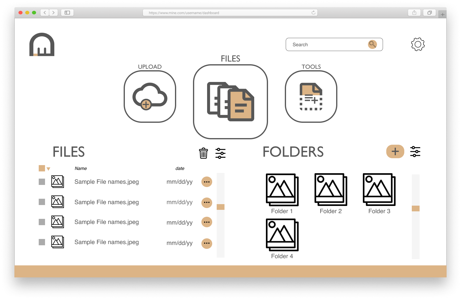
I knew I wanted be minimal in my designs, and so a simple, centralized dashboard seemed to be the best way to organize user choices.
View User Flows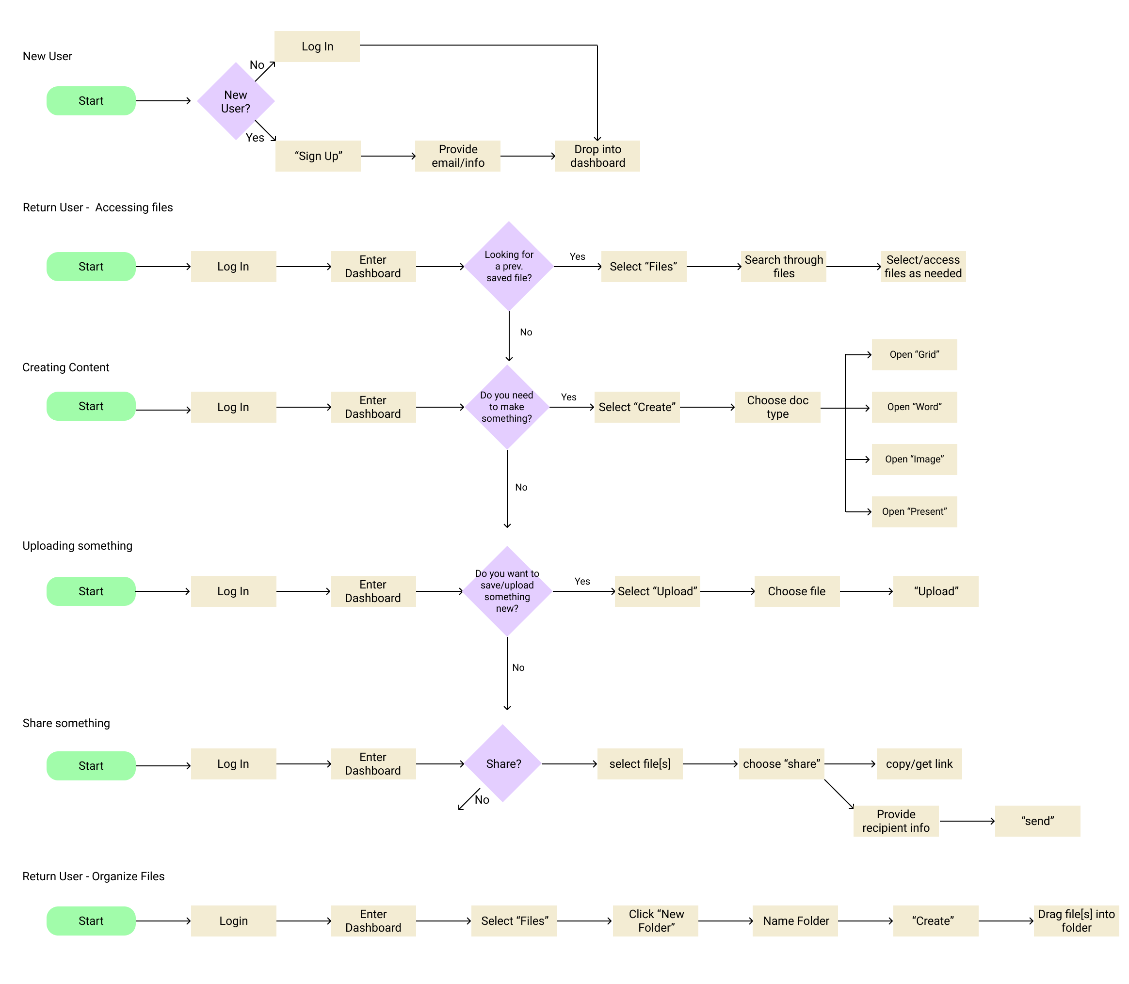
Tasks
- Ability to:
- Sign up for an account
- Create content
- Save files
- Share
- Organize content
Wireframes
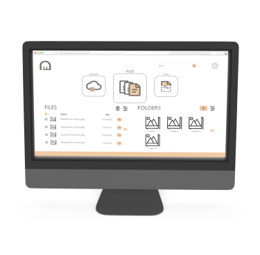
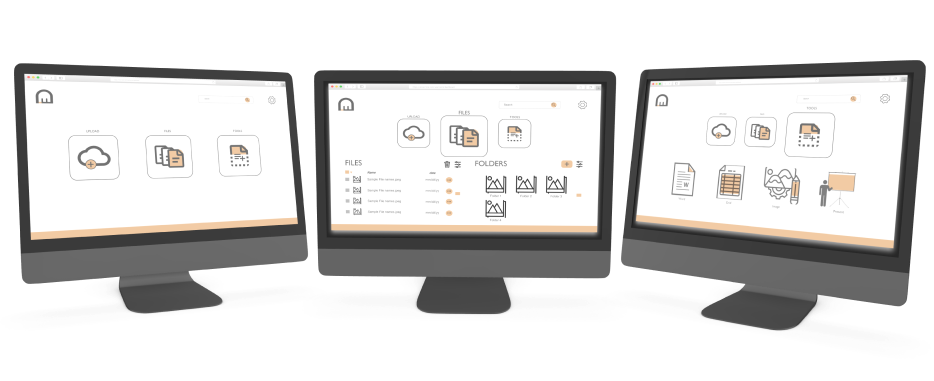
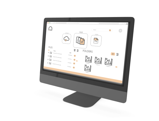
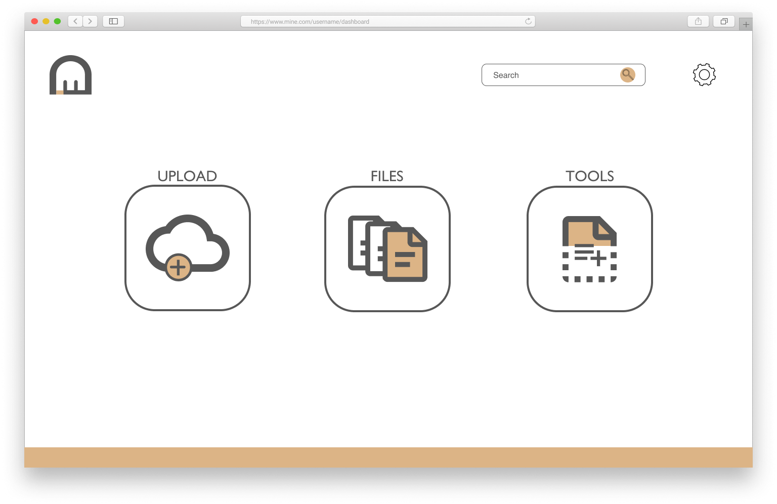
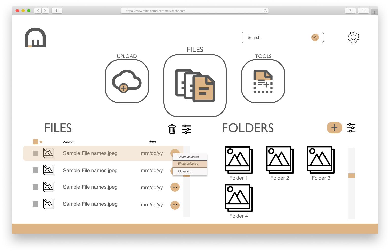
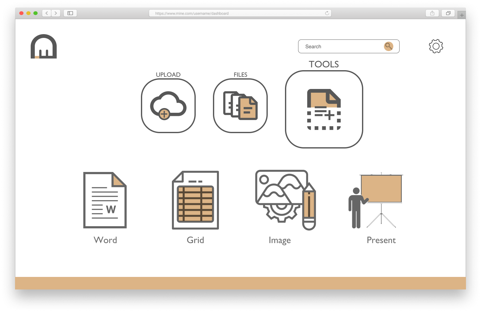
Using my prior research and planning, I built wireframes to explore the potential visual hierarchy of the service. This required multiple iterations in different mediums.
View All Wireframes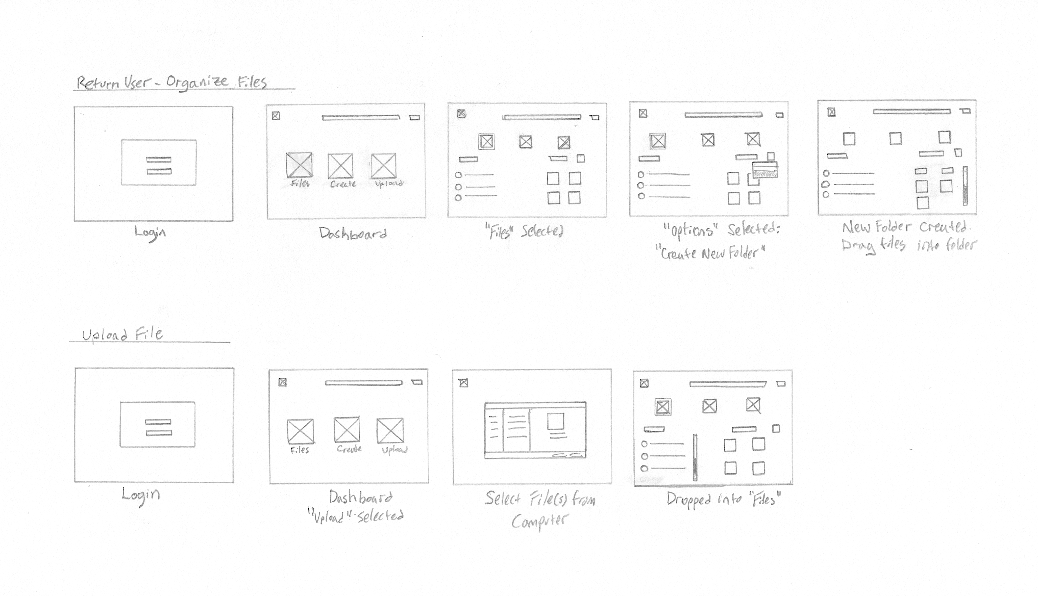
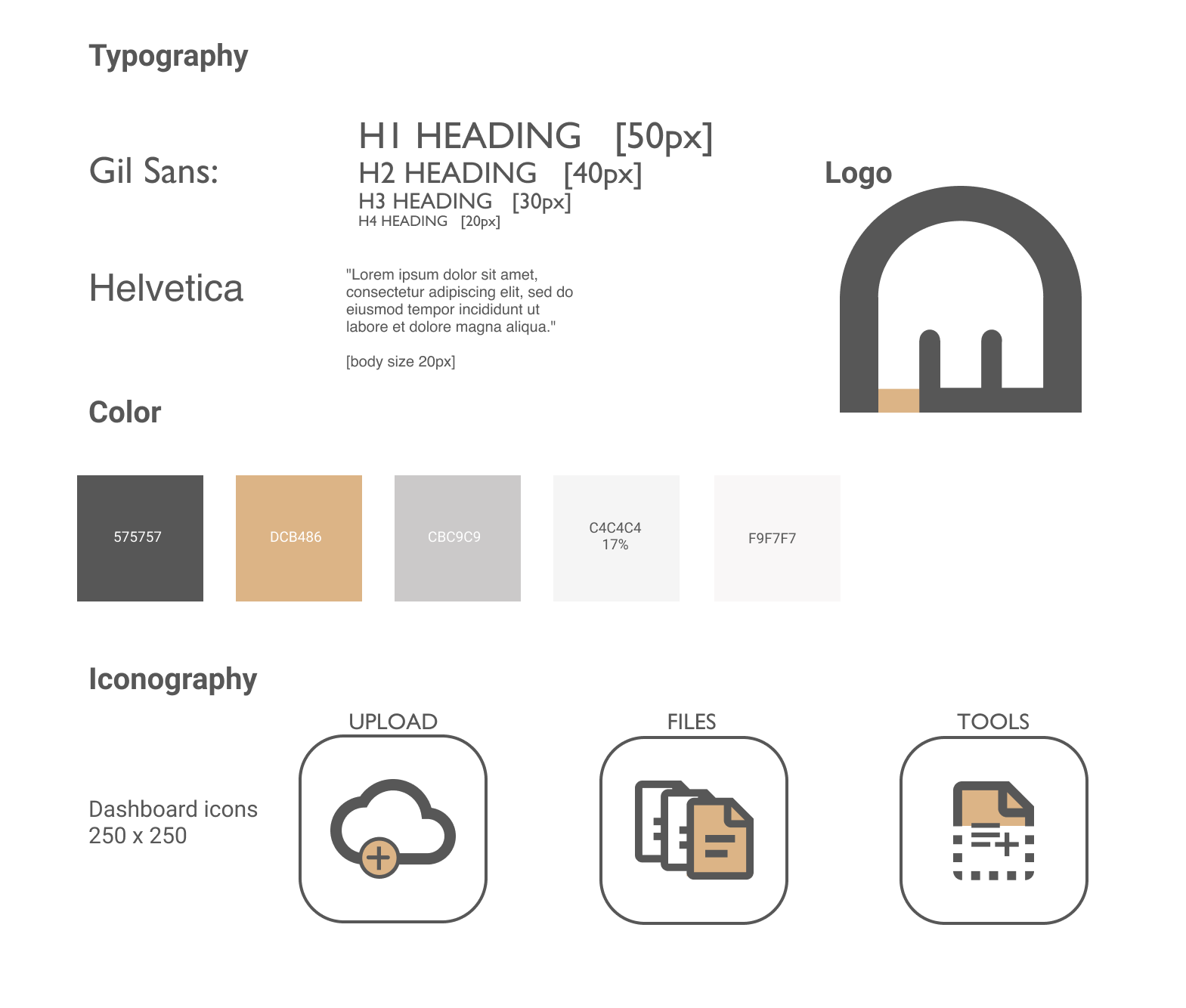
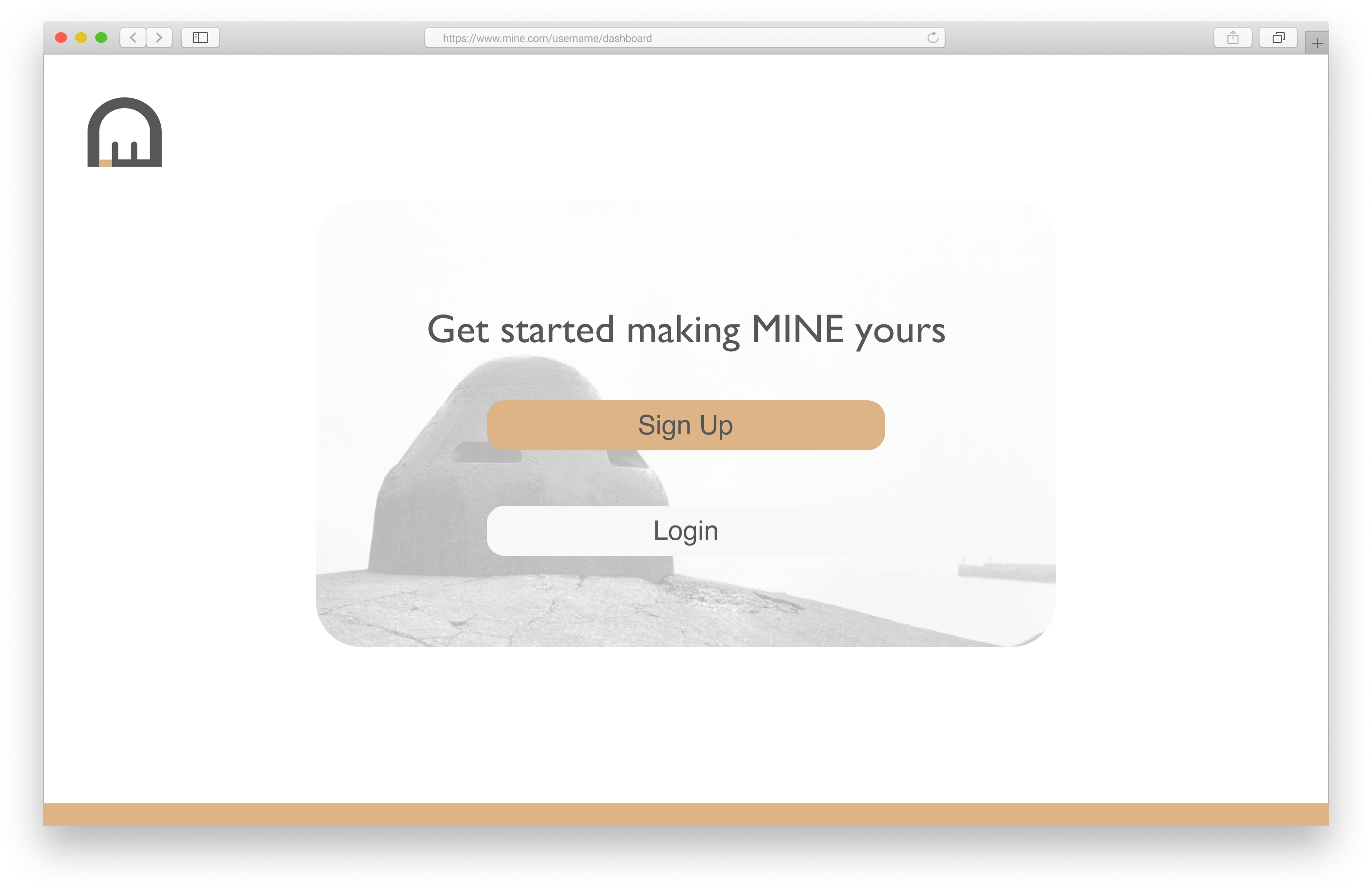
Branding
Next, I needed to develop a compelling brand for the service. When I decided to go minimal, I felt drawn to Brutalist architecture and Mid-Century Modern design. For the logo, I was inspired by the Atlantic Wall bunkers and Le Corbusier’s buildings. I chose a set of san-serif fonts, Gill Sans and Helvetica, to further support the theme.
View Style Guide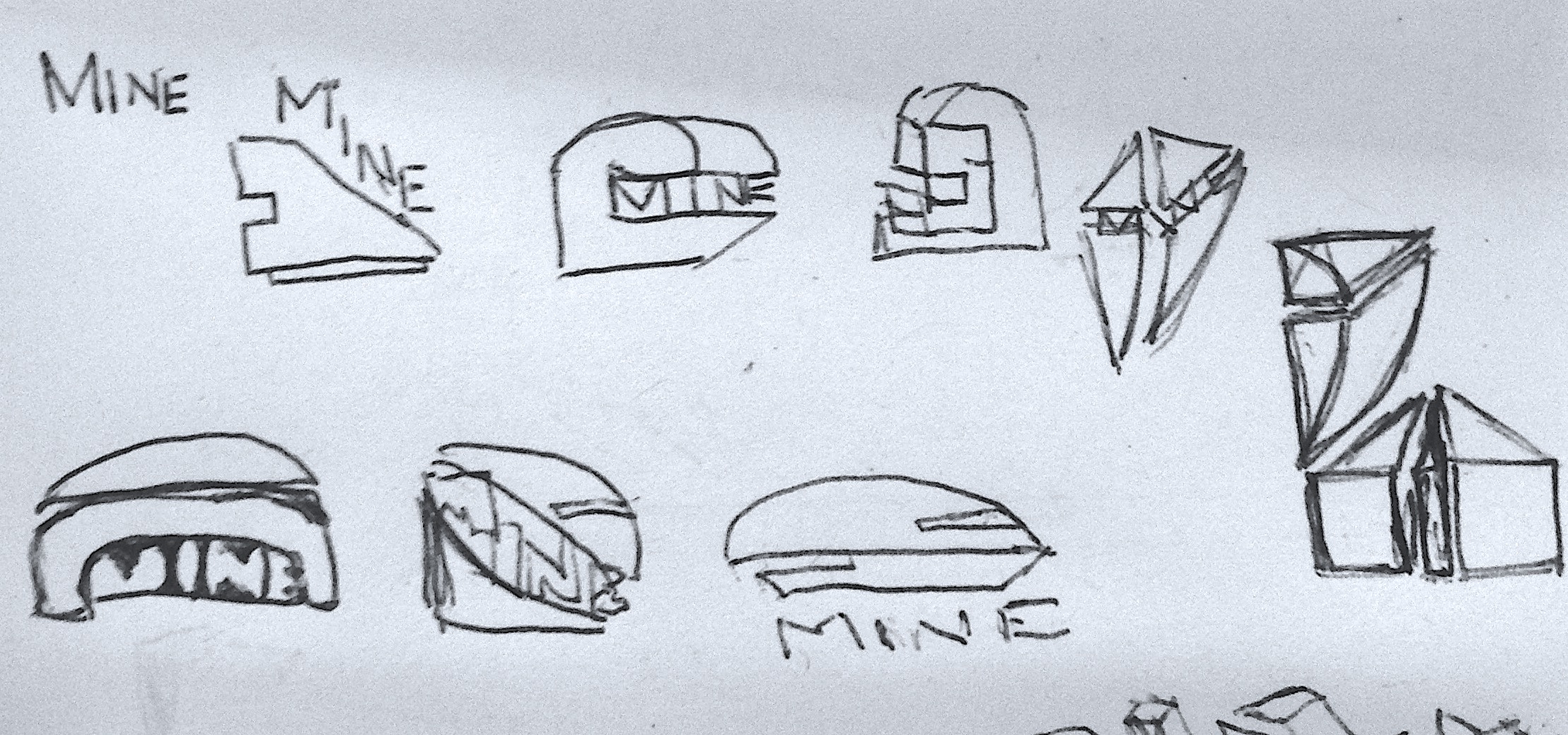
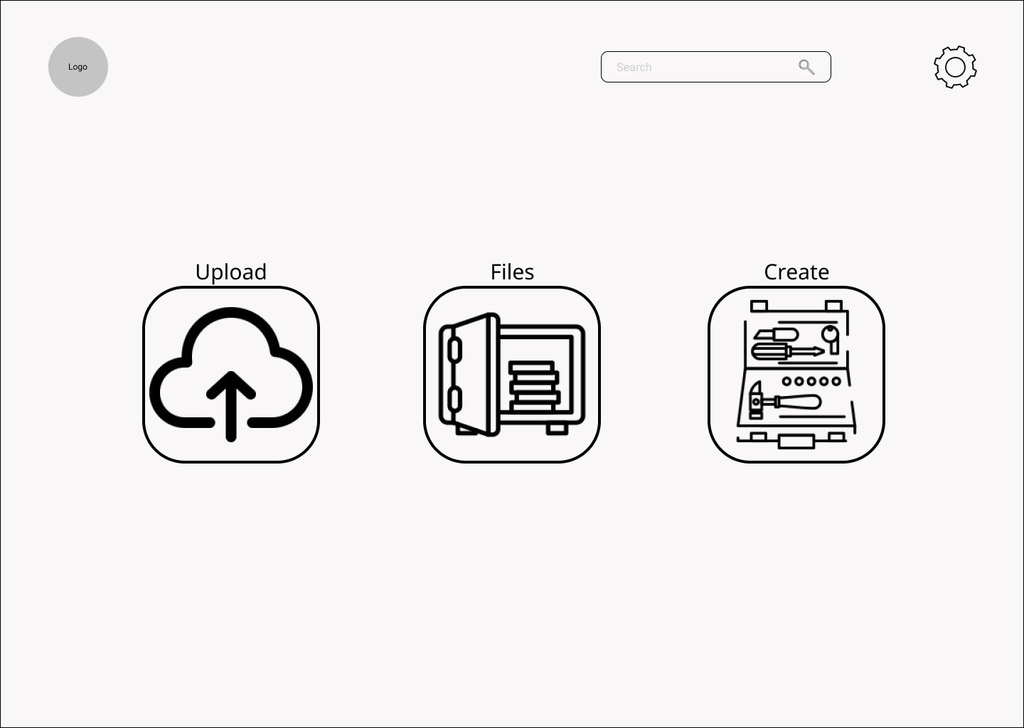
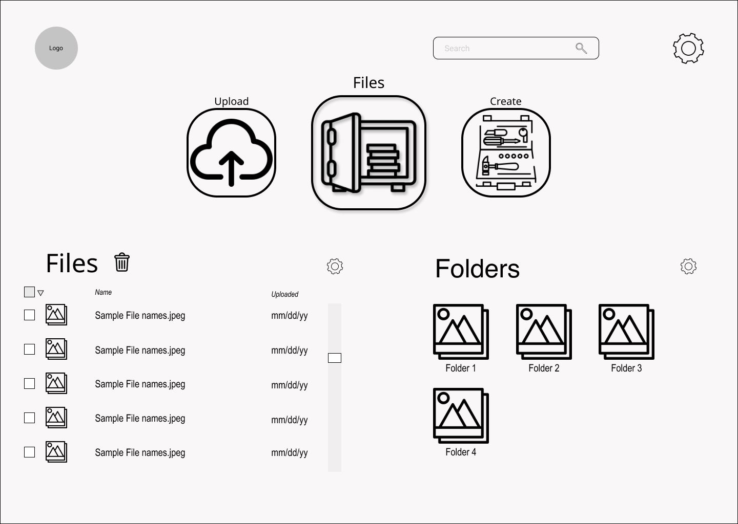
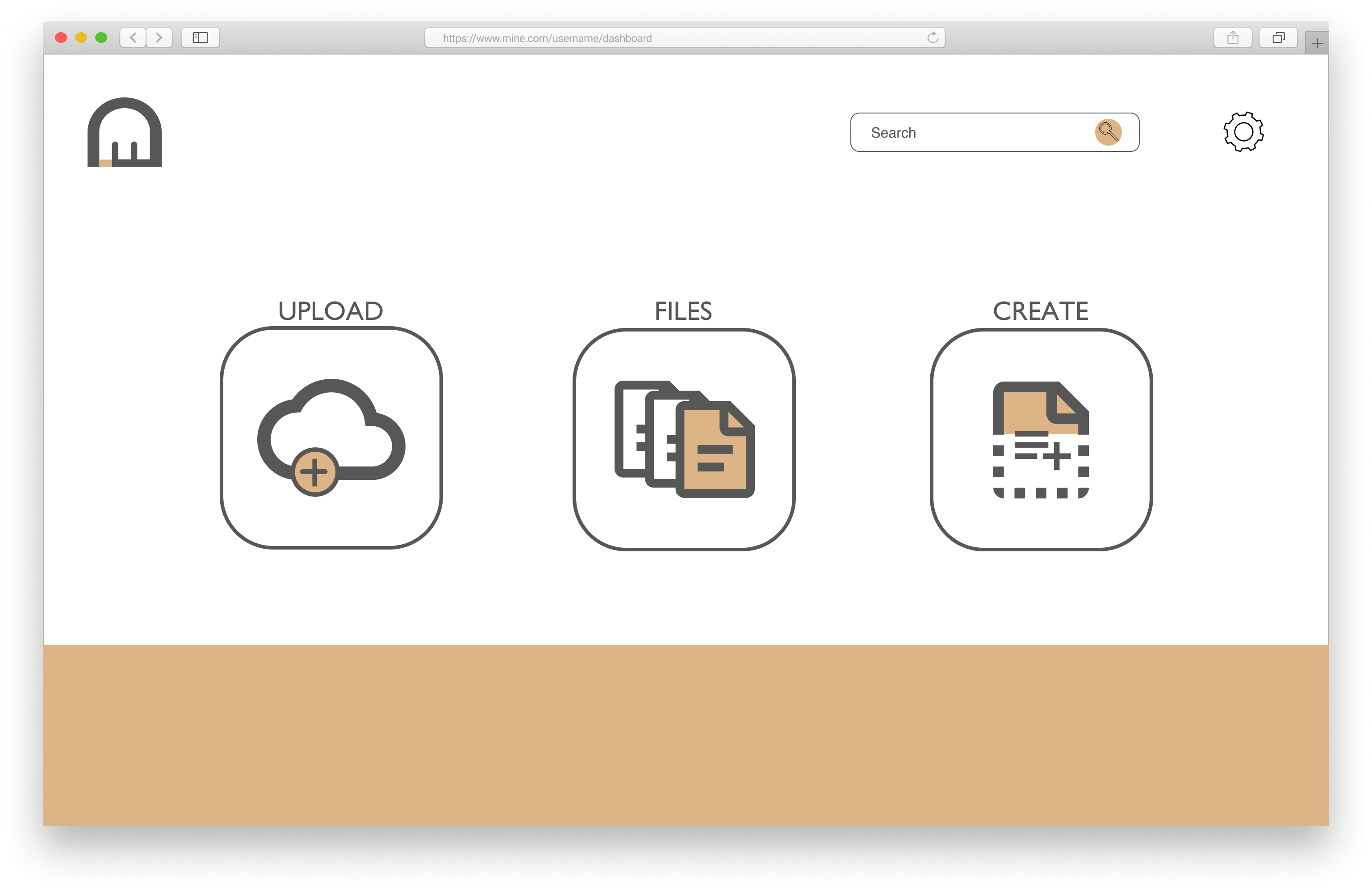
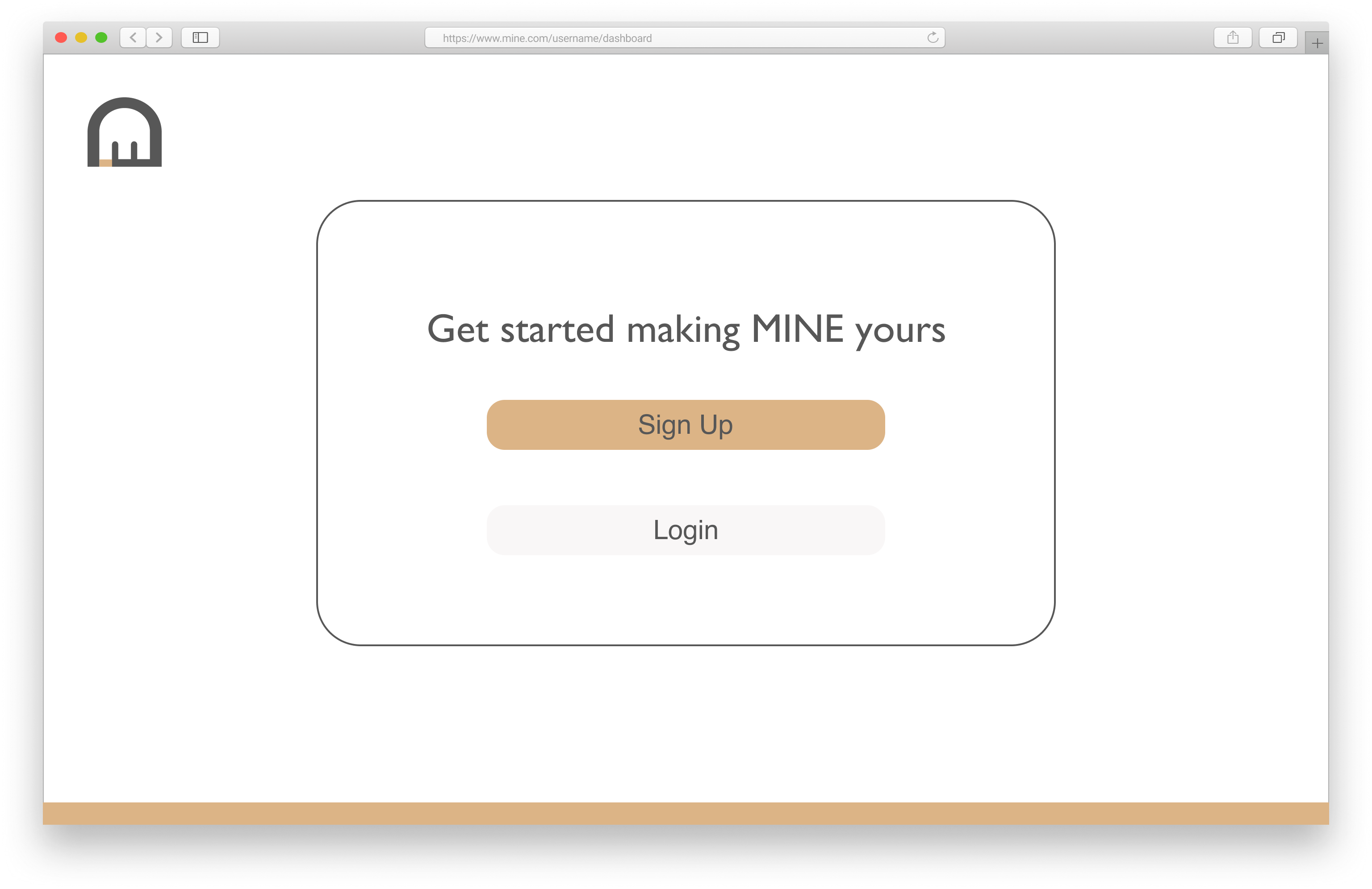
Mockups
The inclusion of the branding elements and testing data allowed me to further refine my wireframes into mockups, which began to better resemble a professional web service.

Testing
To see how users would respond to my design, I asked test participants to complete preference tests and navigate a prototype I built of the service. Insights from the tests allowed me to further iterate on my designs and be confident in my decisions.
Prototype Results
- Ensure selection of files extends to the check box
- Add icons for adding new options/files
- Slider icons for ‘View Options’
- Drag/drop usability
Preference Tests
Conclusion
I believe overall, the project is successful in fulfilling the client’s needs by providing a new take on cloud storage interface.
- The minimal dashboard limits the potential for clutter, and a simplistic two-column organization system for files and folders ensures users will always know where their files are.
- The removal of mysterious or redundant icons around the pages also ensures that if a user wants to complete an action, they do not need to go hunting for the right dropdown.
- Finally, the branding of the service is not aggressive or distracting, and complements the tone the design itself is trying to create.
Despite the successes I believe I achieved, there is always room for improvement.
- My initial survey data was very influential to my later design choices, and I wish I could have done more rounds of testing to tease out more potential insights.
- After developing my design and working on refinements, I also learned that it’s sometimes useful to compromise on your vision to improve the actual user’s experience. Aesthetic purity may not be a winning strategy in UX design.
I will take these lessons into my next projects, and look forward to future challenges.